The polar regions are very vulnerable to a wide range of climate change impact factors, all of which interact to further increase the threat to these regions, and the wider world. The main impact considerations are:
2.1 Rising air and sea temperatures
Global average surface temperature has increased by 0.8°C since the late 19th century but in the polar regions the warming has been considerably greater. In the Arctic, temperatures have increased sharply over most of the region, especially in winter. Winter increases in Alaska and western Canada have been around 3-4°C over the last half century (ACIA 2006). Antarctic Peninsula average annual temperatures have risen above 2.5°C (as recorded at Vernadsky Station) since 1951 (IPCC 2007) Temperature increases are projected to be much greater in the polar regions than for the world as a whole (IPCC 2007; AMAP 2012). It’s important to keep in mind that the warming oceans are a major additional temperature impact concern for the polar regions.
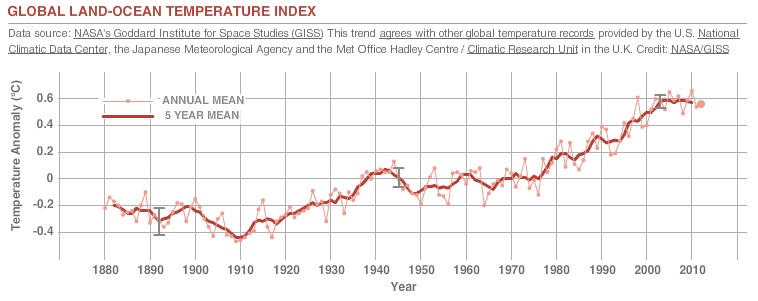
Figure 3. This NASA graph illustrates the change in global surface temperature relative to 1951-1980 average temperatures. Global surface temperatures in 2012 were the ninth warmest on record. (Source: NASA/GISS) The gray error bars represent the uncertainty on measurements. This research is broadly consistent with similar constructions prepared by the Climatic Research Unit and the National Atmospheric and Oceanic Administration. NASA
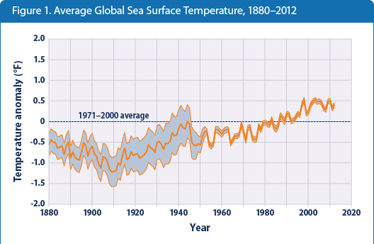
Figure 4. This US EPA graph shows how the average surface temperature of the world’s oceans has changed since 1880. This graph uses the 1971 to 2000 average as a baseline for depicting change. Choosing a different baseline period would not change the shape of the data over time. The shaded band shows the range of uncertainty in the data, based on the number of measurements collected and the precision of the methods used. Data source: NOAA, 2013.
Find out more:
- IPPC: TS.3.1.1 Global Average Temperatures
- Major feedbacks on climate via the cryosphere: AMAP. (2011) Snow, Water, Ice and Permafrost in the Arctic (SWIPA): Climate Change and the Cryosphere. Arctic Monitoring and Assessment Programme (AMAP), Oslo, Norway. Xii + 538pp.
- National Academy of Sciences (2010). Advancing the Science of Climate Change. Accessed December 1, 2010.
- National Academy of Sciences (2006, July 27). Testimony to U.S. House of Representatives — Climate Change: Evidence and Future Projections. Accessed November 30, 2010.
- NASA (2010, January 21). NASA Climatologist Gavin Schmidt Discusses the Surface Temperature Record. Accessed November 30, 2010.
- NASA Earth Observatory (2010, June 3) Fact Sheet: Global Warming. November 30, 2010.
- NOAA National Climatic Data Center (n.d.). Global Warming Frequently Asked Questions. Accessed December 1, 2010.
- NOAA 2012 Arctic Report Card
- NOAA State of the Climate in 2012
- Romanovsky & Osterkamp 2001. Permafrost Response on Economic Development, Environmental Security and Natural Resources. Ch: Permafrost: Changes and impacts. Pp: 297-316 (Book)